
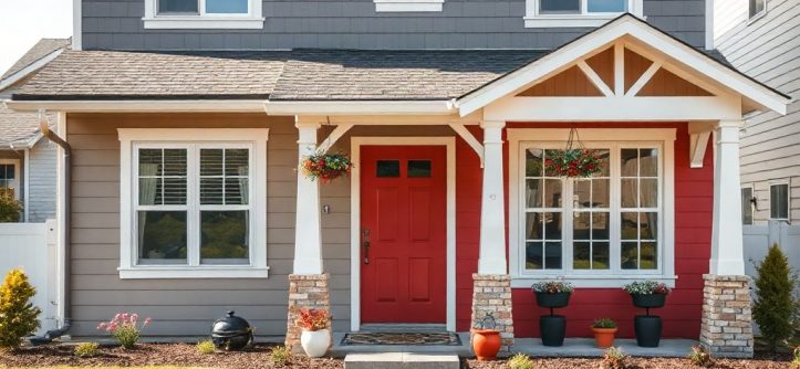
Trending home exterior color combinations for 2027 reward homeowners who think in palettes, not single paint chips. The shift is toward grounded earth tones paired with soft contrast, warm whites instead of stark ones, and accents borrowed from stone, clay, and timber. If you are planning a repaint or designing a new facade, the right pairing can make an ordinary house look considered and current. Sites like HomePlanIdea show how color choices reshape a home’s curb appeal, and this guide explains which pairings will define the year ahead.
Quick answer: Choose a warm, natural base color for most of the facade, add one deeper shade for trim, doors, or gables, and limit bold accents to small areas. Neutral earth tones with soft contrast photograph well, age gracefully, and stay appealing for a decade or more.
What is trending home exterior color combinations?
The phrase describes the specific pairings of siding, trim, roof, and accent colors that are gaining traction for the coming year. A combination works when the three or four colors on a house relate to each other on purpose. The trend for 2027 leans warm and grounded, moving away from the cool grays that dominated the past decade.
Here is what the leading pairings look like in practice:
- Warm white with bronze trim. A creamy off-white siding paired with dark brown-bronze trim and a muted charcoal roof.
- Sage green with warm gray. Soft green siding, a light greige trim, and a natural wood door.
- Clay and sand. A terracotta-toned accent wall or gable paired with sandy beige siding and off-white trim.
- Deep navy with warm white. Navy siding lifted by creamy trim and a natural oak door.
- Charcoal with cedar. Dark gray siding contrasted by warm wood soffits or columns.
Each combination shares a common trait: one dominant color, one supporting color, and one accent. The dominant color covers the largest surface, usually the siding. The supporting color handles trim, fascia, and garage doors. The accent appears on the front door, shutters, or a single architectural feature.
Warm neutrals are the anchor of nearly every combination. They read well in both bright sun and overcast light, and they flatter brick, stone, and concrete without clashing.
Why warm neutrals replaced cool grays
Cool gray siding became so widespread that it started to blend into the streetscape. Warm whites, beiges, and greiges offer contrast against gray pavement and cloudy skies. They also pair more easily with wood and natural stone, which many homeowners are adding to porches and entryways.
In every 2027 combination, contrast stays gentle. The goal is depth through related tones, not a stark light-and-dark split.
Takeaway: Think in a three-color system — dominant, supporting, accent — and keep the palette warm and related.
Why trending home exterior color combinations matters
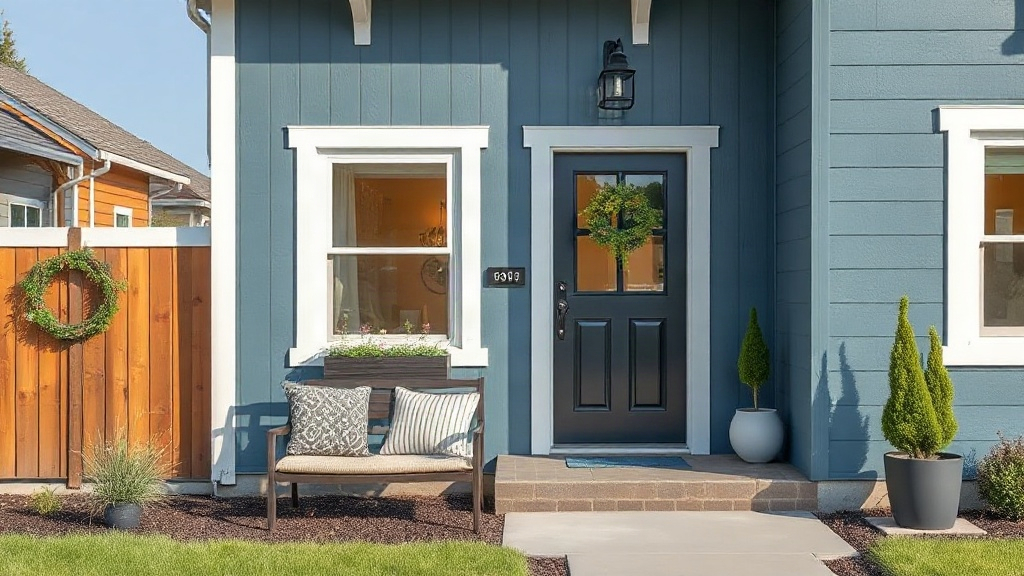
Exterior paint covers the largest visible surface of your property. Color choices affect resale appeal, how the house sits against its surroundings, and even how often you need to repaint. A combination that suits the architecture and the light will look right for years; a fashionable mismatch can look dated in three.
Resale and first impressions. Buyers decide within seconds of seeing a home. A coherent palette signals that the property has been maintained and considered. Odd color pairings raise questions about what else may be neglected.
Architectural fit. A Craftsman bungalow and a modern box need different treatments. Earth tones and wood accents suit traditional styles, while crisp warm whites with dark trim suit contemporary homes. Forcing an incompatible trend onto the wrong house is the most common regret homeowners report.
Longevity. Neutral bases stay current longer than bold ones. If you plan to sell within five years, a warm neutral base with a restrained accent gives you the widest appeal. If you plan to stay for twenty years, you have more room to follow your own taste.
Climate and light. In hot climates, lighter colors reflect heat and keep siding cooler. In cold, overcast regions, warmer tones prevent a house from looking bleak against gray skies. For a broader review of how region and light influence home exterior color decisions, look at how neighboring homes read in different seasons before you commit.
Paint large sample boards and view them on all four sides of the house at morning, noon, and dusk. Exterior colors shift dramatically with light direction.
Takeaway: Color choices are a long-term exterior decision with resale, comfort, and maintenance consequences — treat them with the same care as a roof purchase.
Best practices
Start with the fixed elements you cannot easily change: roof color, brick, stone, and driveway. These set the boundaries your paint palette must work within. A brown roof wants warm tones nearby; a charcoal roof can support either warm or cool palettes.
Limit the palette to three colors. A dominant siding color, one trim color, and one accent covers almost every home. Adding a fourth or fifth color fragments the facade.
Choose contrast deliberately. High contrast — dark trim on a light house — creates a crisp, graphic look. Low contrast creates a softer, blended appearance. Pick one and apply it consistently.
Match the sheen to the surface. Satin or eggshell finishes suit siding, while semi-gloss works on trim and doors. Sheen affects how color reads, so test finishes along with hues.
Sample on the actual house. A chip that looks perfect in the store can turn muddy on a north-facing wall. Paint a section of siding, trim, and door with your chosen combination and live with it for a week.
Paint the garage door as part of the composition. Many homeowners forget the largest flat surface on the facade. It should typically match the siding or sit between siding and trim in tone.
Here is a quick comparison of the two contrast approaches:
Comparison: high contrast vs. low contrast
High contrast reads as graphic and modern; low contrast reads as soft and traditional. Match the approach to the architecture, not to the moment.
| Factor | High contrast | Low contrast |
|---|---|---|
| Light house, dark trim | Crisp, graphic | — |
| Tonal pairing | — | Blended, calm |
| Best for | Contemporary, farmhouse | Craftsman, ranch |
| Forgiving of flaws | Less | More |
Takeaway: Fix your palette at three colors, decide contrast up front, and always test on the actual house.
Common mistakes to avoid
Picking colors on a screen alone. Screens distort hue and brightness. Two chips that look identical online can read very differently under sunlight. Always confirm with physical samples.
Ignoring the undertone. A trim color that is technically white but carries a pink or yellow undertone will clash with cool siding. Match undertones across every color in the palette.
Following a trend that fights the house. A trend should support the architecture, not cover it. A minimal white-and-black palette on a cottage with heavy stone detail strips the home of its character.
Skipping the roof and hardscape. The roof is a huge color block visible from the street. If the palette ignores it, the overall effect falls apart no matter how good the paint looks.
Forgetting the details. Gutters, downspouts, soffits, and window frames all carry color. Order these elements deliberately rather than defaulting to whatever the installer suggests.
Painting too many accent surfaces. Accents work because they are rare. Painting the front door, shutters, porch posts, and gable all in the boldest color makes the facade busy.
Homeowners associations and local historic districts may restrict exterior colors. Confirm the approval process before ordering paint.
Takeaway: Most exterior color mistakes come from skipping samples, ignoring undertones, and treating details as an afterthought.
FAQ
How many colors should an exterior palette have?
Most well-composed homes use three: a dominant siding color, a supporting trim color, and one accent. Larger or more complex homes can stretch to four, but each added color must have a clear job on the facade.
Do trending exterior colors go out of style quickly?
Bold, high-fashion pairings age fastest. Warm neutrals with restrained accents tend to stay current for a decade or more. If long-term appeal matters to you, anchor the palette in a neutral base and express trends through small accent areas.
How long does an exterior repaint last?
Most exterior paint systems last roughly seven to ten years, depending on climate, surface preparation, and sun exposure. A proper primer and quality paint matter more than the specific hue, so budget for surface preparation before color.
Can I paint just the trim and front door to update the look?
Yes, and it is the most affordable route. Repainting trim and the front door in a fresh combination changes the facade’s character without touching the siding. Keep the trim tone related to the siding so the house still reads as one composition.
What color should the garage door be?
Usually the siding color or a tone between siding and trim. A garage door in a bold accent competes with the front door. If you want contrast, aim for subtle depth rather than a strong second color on a large surface.
Conclusion
The combinations that will define 2027 are built on three ideas: a warm neutral base, gently related tones, and a single accent that earns its place. Fix the colors you cannot change first, then test your palette on real sample boards in real light. Avoid the temptation to chase a bold trend across the whole facade — depth and restraint age far better than drama. Your next step is simple: photograph your current exterior, gather a few sample boards in warm neutrals, and view them against your roof and hardscape before any paint is ordered. A weekend of testing can save years of regret on the largest surface your home presents to the world.



Leave a Reply